Sunderland city app
UI/UX Design, Illustration

Overview
Platform
Mobile (iOS & Android)
Background
Sunderland City Council were embarking on a regeneration project, embedding a network of smart sensors throughout the city, gathering data on footfall, traffic, air quality, streetlights and weather.
They aimed to provide residents and visitors with a central place to find out what was on, how they could get around and discover things throughout the city. This information already existed, but was spread across different websites and services and was sometimes out of date. The information provided would be also shaped by the data collected by the smart sensors.
There was an extensive consultation process with residents before any kind of ideation process began, but the core principle for whatever the product was to become was to do a few key things very well.

Research & Discovery
I was part of a team of two designers and one user researcher. I was responsible for the wireframes, UI designs and illustrations on the project, having worked alongside my manager on a thorough research and competitor analysis process. There were a series of interviews conducted with stakeholders from within the council as well as Sunderland residents. Data was gathered on who these people were, their confidence with tech and what they felt would be useful to them.
During this research phase we produced two documents for the council summarising our findings, before moving on to ideating on what the app would include and how it might work.

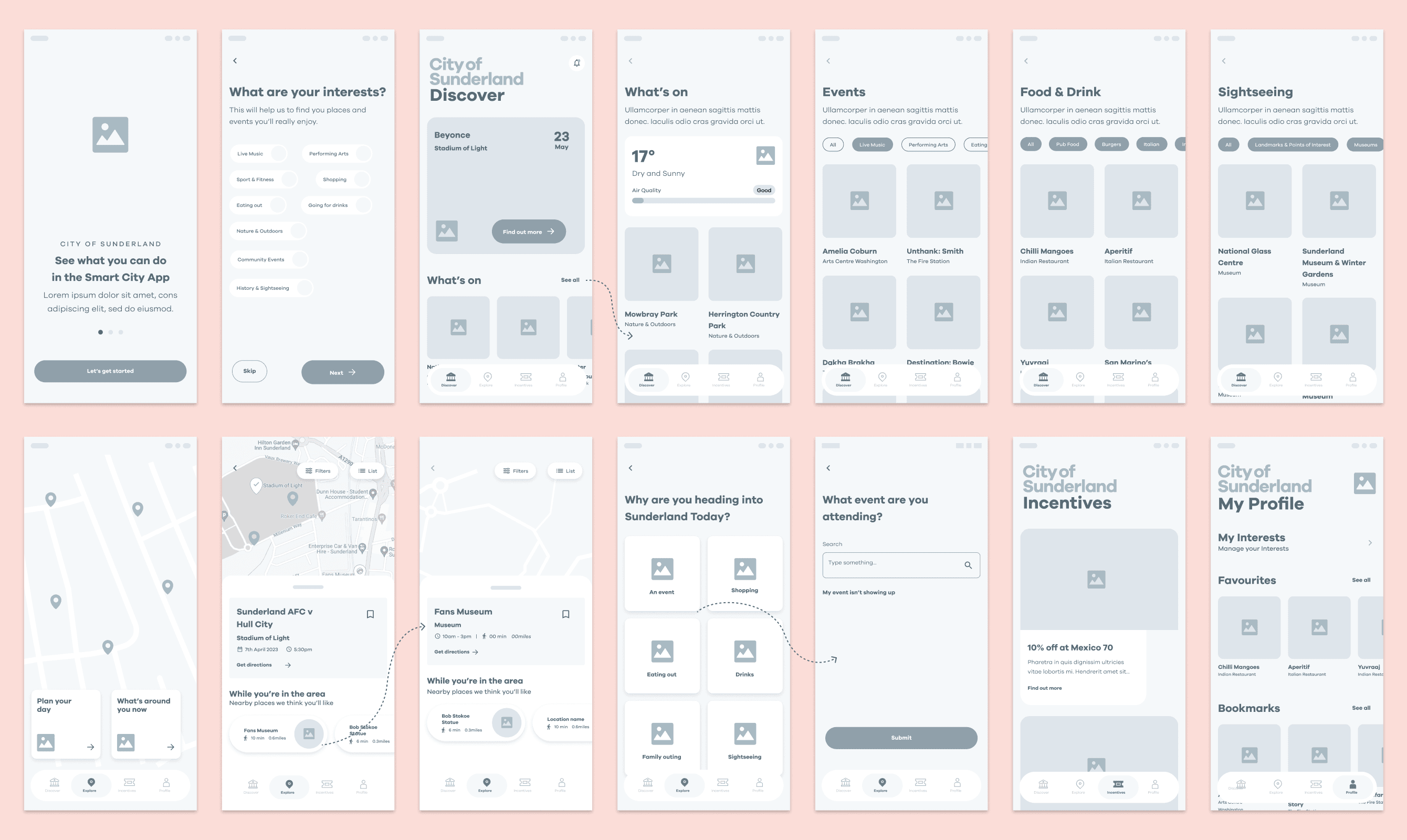
Using the information gathered during the research process and what was most important to residents, we determined that the app should be focussed on things to do, how best to get around and offers and incentives from local businesses.
The suggestions the app served up to users would be informed by the smart sensor data, so a user would see different things on a dry afternoon to a rainy evening for example. But they would also be heavily influenced by the user’s individual preferences and interests. This required an in-depth onboarding process which had to gather the relevant information without frustrating the user before they had a chance to look around.

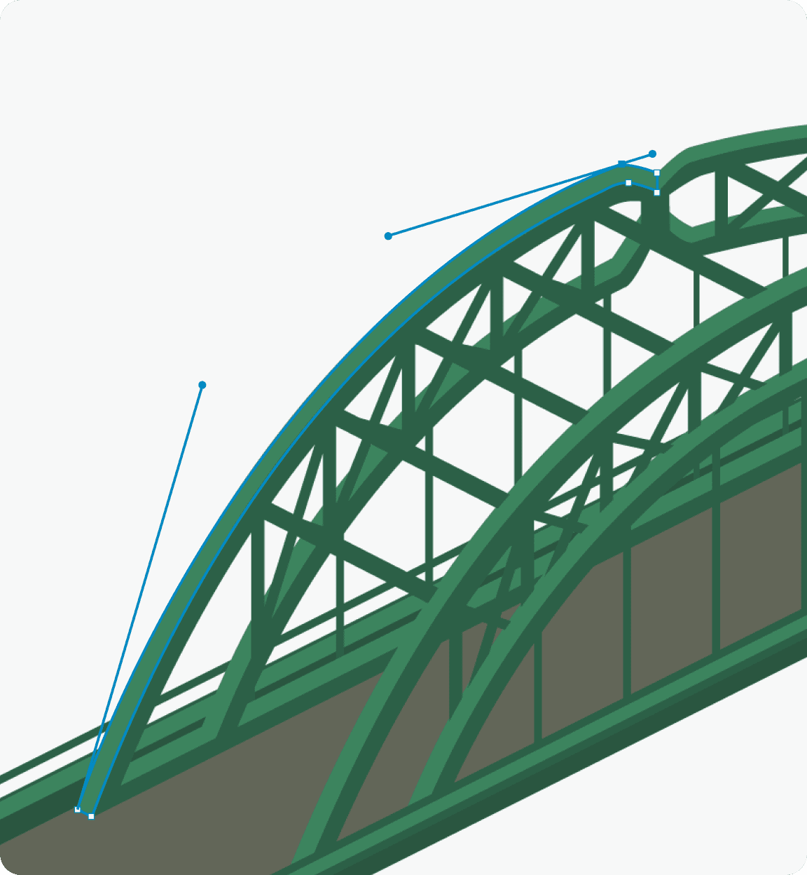
The council had recently been rebranded, so colours and fonts were already in place. I designed the UI and illustrations around these, aiming to make sure they complimented the character of the visual language that had been set out for them.
I built a component library and thorough prototypes in Figma to help the developer with handover.


Explore
The Explore tab of the app helps users to plan a day out around something they already have planned or a point of interest nearby. From an initial starting location or event, the app suggests things nearby that might be of interest. These suggestions are driven by the user’s individual preferences and the sensor data.
If someone was planning to attend an event at the Fire Station, nearby restaurants and bars would be suggested that matched their preferences. If they were planning lunch and it was dry, it might suggest a park visit and a nearby bar. This was intended to aid the council's aim of encouraging people to spend more time in the city.


Getting about
Users are able to switch between footfall and traffic data in order to plan their travel. This might allow them to avoid congested roads or opt to stick to areas with heavier footfall when walking alone - addressing concerns over nighttime safety.

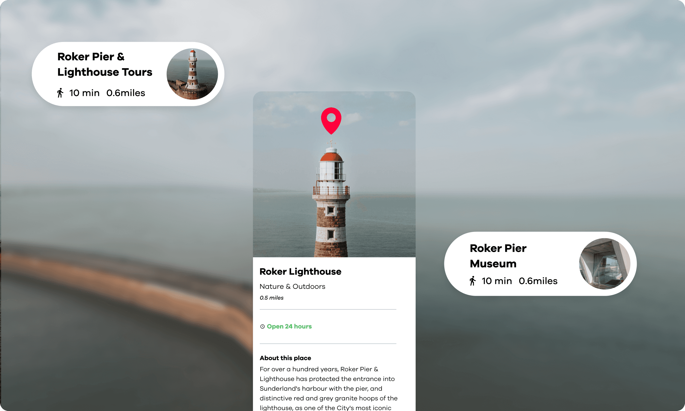
The app has grown steadily since it was launched and is still being used by over 8000 people.