DIBI Conference
Visual Branding, Graphic dESIGN
Overview
Platform
Web
Social Media
Background
DIBI (Design It; Build It) is a design and development conference that’s been running since 2009. When it changed hands in 2022 it was an established fixture with a real legacy, but the brand was a little outdated.
The conference sought to build a visual identity that communicated everything it had become. A forward thinking product conference with international speakers from both technical and creative disciplines. It needed to be slick while conveying a warmth and fun.

I was responsible for creating and growing the visual branding for the conference. The original logo was still working for the conference, so that was retained.
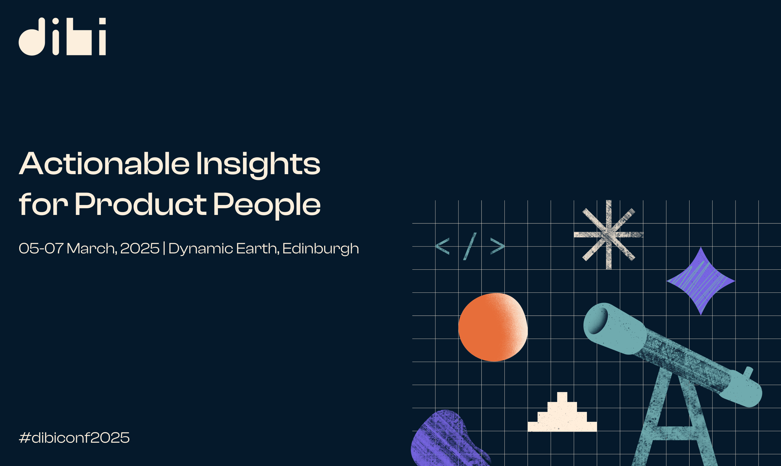
This new visual language needed to be both playful and considered, combining a human touch with a kind of mathematical order. I decided to communicate this by collaging graph paper and geometric shapes with hand-painted textures.
I also wanted to tie the brand to Edinburgh, where the conference is based. As a city historically linked with scientific innovation and creativity, DIBI saw this as being reflective of their conference ethos. I used the landscape and architecture of the city as a basis for some of the shapes used to build the graphics and illustrations.


Laying the foundations
The brand font would have to work well on everything from large scale print displays to social media. I chose to use Clash Display, a high-impact neo-grotesk intended for use on a large scale for headings. I paired this with Satoshi, a readable modernist sans-serif for body copy - it was ideal for text-heavy running orders and made for a strong contrast with the headings font.
The primary dark navy colour conveys a sense of trust and authority while providing a high-contrast background for the other punchier colours in the palette, any one of these can be used as an accent colour.



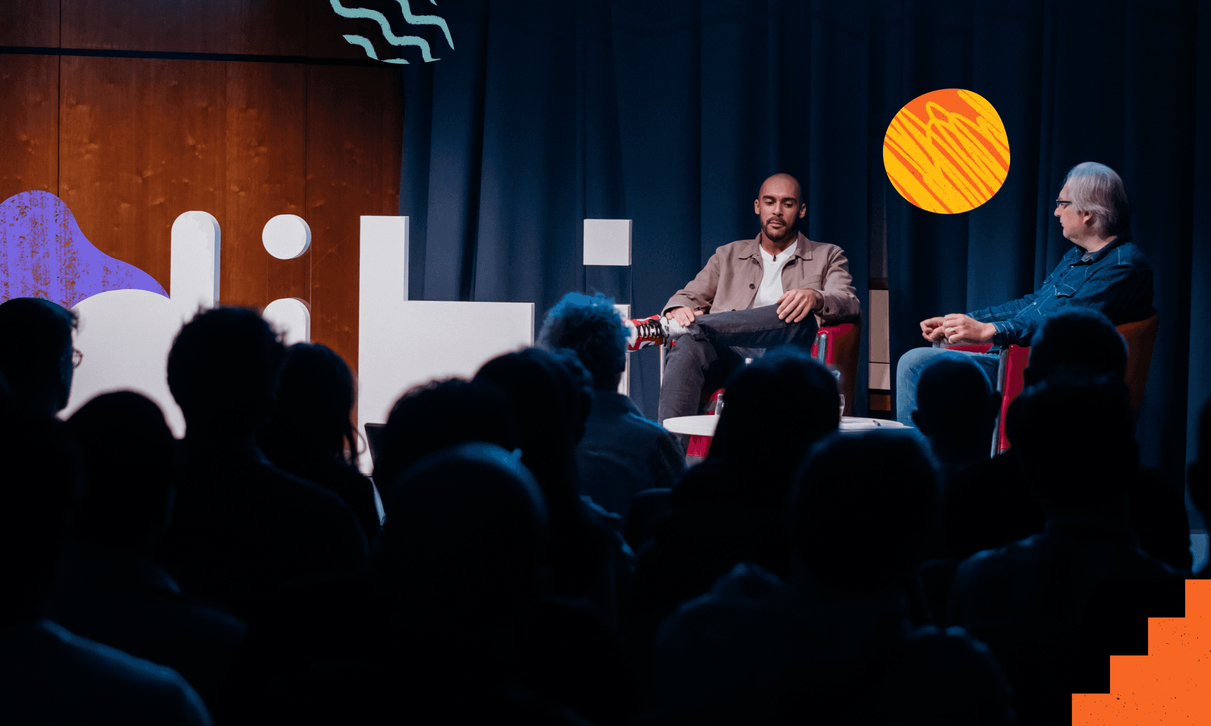


In the brand's second year I started to develop its visual language. Making use of the off-white as a background colour and using flat colour and one large shape for more impactful compositions, in addition to the more playful collage designs.
The conference has a busy social media schedule promoting the conference requiring a lot of graphic design work, so the way I used visual elements set up originally expanded over time.
